F Example Dashboard
Communicating quantitative trends to a community with a quantitative phobia can be difficult. This appendix showcases a dashboard style that has evolved during the past few years of OSDH Home Visiting, where twelve local programs practitioners implemented their own intervention ideas tailored to their interests and community.
Over 50 dashboards have been developed: a custom dashboard is developed for each program’s cycle, and a three additional dashboards communicate the results of program-agnostic investigations. A style guide is an important tool when managing this many unique investigations
For a program-specific dashboard, it’s more important to meet the needs of the individual PDSA than to conform to a guide. However, we aim to make the dashboards as consistent as possible for several reasons:
- It’s less work for the practitioners. A familiar presentation will help the practitioners grow comfortable with their new cycle’s dashboard. Recall most will use at least five dashboards in only a few years.
- It’s less work for the analysts/developers. Within a cycle, a consistent format (with relatively interchangeable features) means that one analyst can more easily contribute and trouble shoot a colleague’s dashboard.
- The lessons we’ve learned (and mistakes we’ve made) can be applied to later dashboards. The quality should improve and the development should quicken.
Just like our CQI grant encourages an HV program to learn from its history and to learn from others, we as analysts should too. As we work with the programs to design a PDSA, each one analyst will learn about the strengths and weaknesses of our current dashboard style, and propose improvements.
F.1 Example
A example dashboard that mimic the real CQI is available at https://ouhscbbmc.github.io/data-science-practices-1/dashboard-1.html. The dashboard source code is available in the analysis/dashboard-1 directory of the R Analysis Skeleton repository’; this repo contains the code and documents the entire pipeline leading up to this dashboard.
We’ve had success developing and distributing dashboards as self-contained html files. They are portable and don’t have dependencies on local data files or remote databases, yet the JavaScript and CSS provide a modest amount of interactivity. The dashboard’s principal components are flexdashboard, plotly, ggplot2, and R Markdown.
In this dashboard of synthetic data, a cognitive measure is tracked across 14 years in three home visiting counties.
F.2 Style Guide
This section describes a set of practices that the BBMC analysts have decided are best for the CQI dashboards used in our MIECHV evaluations. In a sense, this CQI dashboard guide supplements our overall style guide.
The MIECHV CQI dashboards are based on RStudio’s flexdashboard package, which uses rmarkdown, JavaScript, and CSS. flexdashboard has a great website that should be read by anyone adapting this guide for their own CQI projects.
F.2.1 Headline page
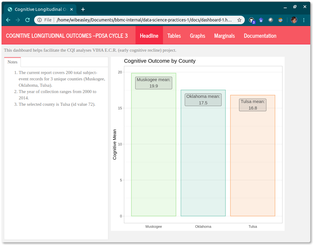
The dashboard’s greeting should be a good blend of (a) orientating the user to the context and (b) being welcoming but not overwhelming. For the second PDSA cycle, try to have only one or two important and impactful graphs on the first page; specialized graphs have their own pages later.
-
Left column: Text qualified with
{.tabset}-
Notes tab: text that provides info about the dashboard’s dataset, such as
- Count of (a) models, (b) programs, (c) clients, and (d) observations
- Date range
- The specific
program_codes. Even though a PDSA is focused on a specific program, ideally other programs are included so they have a feel for what others are doing.
-
Notes tab: text that provides info about the dashboard’s dataset, such as
-
Right column: Headline Graph(s) optionally qualified with
{.tabset}.- Ideally starts with an overall graph, with no longitudinal component.
- Show data only from the program, not the overall model.
F.2.2 Tables page
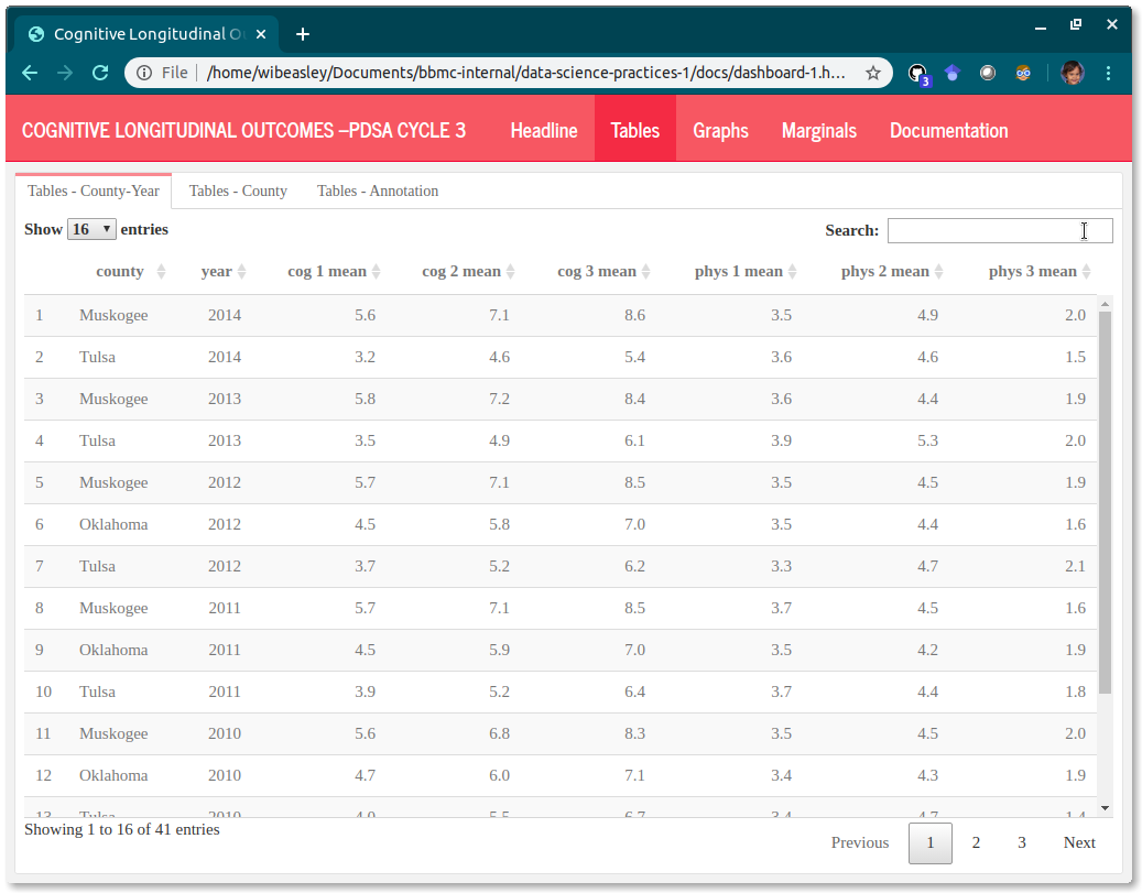
The tables provide exactness, especially the exactness of (a) the actual y value and (b) the frequency of the longitudinal values. These tables make it easier to see if you’re inadvertently plotting multiple values for the same month, or if some month is missing. In the future, we can add a ‘Download as CSV’ button if anyone requests it.
Another advantage of the tables is that all measures are visible in the same screen. A typical program-month table will have at least 6 columns: program_code, month, model, outcome measure, process measure, and disruptor measure. If this is difficult to do, then the upstream scribe probably isn’t doing its job well. These tables should be almost untouched from the rds files created in the ‘load-data’ chunk.
Each tab should represent a different unit of analysis (e.g., a single row summarizing the completed visits for a program-month). Use all the tabs below that are appropriate for the PDSA. Go from biggest unit (e.g., model) to smallest unit (e.g., Provider-Week).
-
Unnamed column qualified with
{.tabset}.- Model tab
- Program tab
- Program-Month tab
- Program-Week tab
- Provider-Week tab
- Spaghetti Annotation tab If your spaghetti plots use faint vertical lines to mark events (e.g., the start of a PDSA intervention), include the events here too.
F.2.3 Graphs page
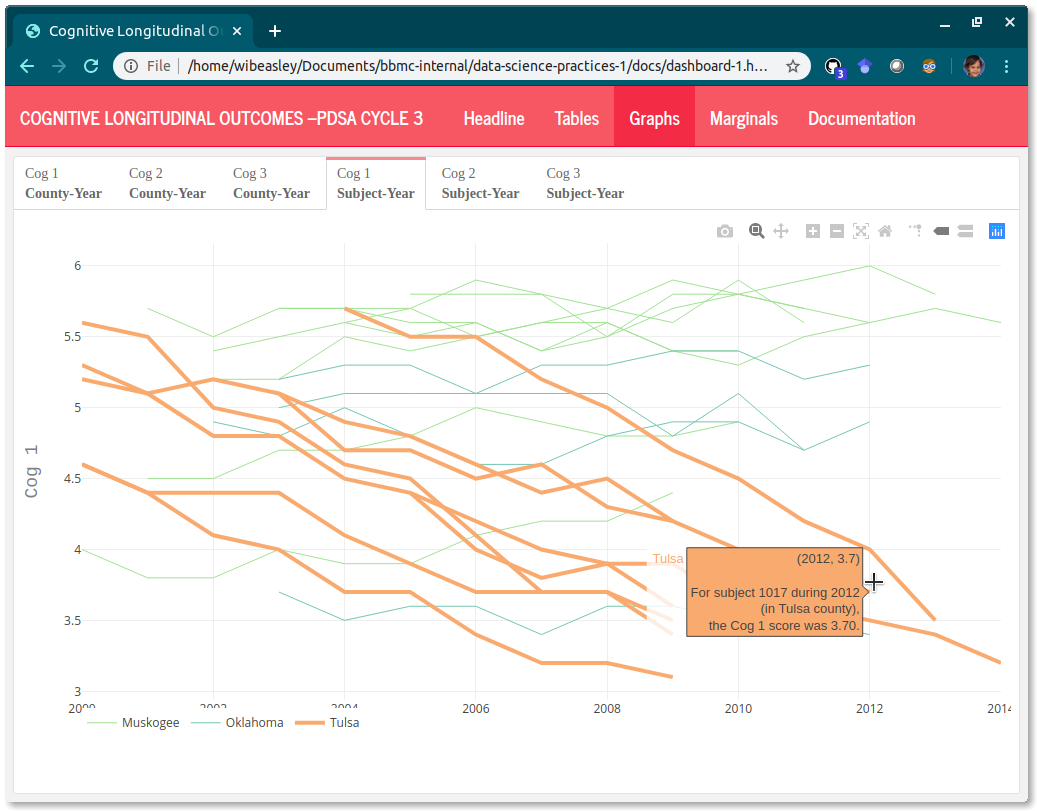
The graphs plots should provide the user with a feel of the trends. One graph focuses on one measure, so ideally a max of three spaghetti plots. Ideally the change over time (for the PDSA’s program) is compared to the other programs during the same period. If a PSDA has multiple Process Measures, give them separate tabs labeled ‘Process Measure 1’ & ‘Process Measure 2’.
-
Unnamed column qualified with
{.tabset}.- Outcome Measure tab
- Process Measure tab
- Disruptor Measure tab
If a spaghetti plot depicts a proportion/percentage measure, then include a visual layer the count/denominator behind each proportion (instead of a separate spaghetti plot dedicated to the denominator). This may include one or more of the following:
- geom_point where presence/absence denotes a nonzero/zero denominator
- geom_point where size denotes denominator’s size.
- geom_text (in place of geom_point) that explicitly shows denominator’s size
- geom_text along the bottom axis that explicitly shows denominator’s size
- use
spaghetti_2()located in display-1.R. (not yet developed.) Add hover text to each spaghetti.
F.2.4 Marginal Graphs page
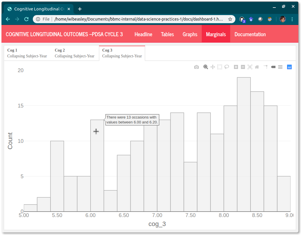
The marginal histograms provide context.
Single column, qualified with
{.tabset}.-
Contains a marginal/univariate graph of all variables in the analysis.
- Marginal graph of outcome measure
- Marginal graph of process measure
- Marginal graph of disruptor measure
Show data only from the program, not the overall model.
Use
histogram_2()located in display-1.R (this link is accessible only to Oklahoma’s MIECHV evaluation team). Add hover text to each histogram.If all datasets are the same unit of analysis (e.g., ‘program-month’), then don’t use an H3 tab. Use (H3) tabs if you have marginals more than one level (e.g., visit date at program-month, visit date at program-week, visit date at provider-week). But avoid multiple levels, if possible; especially if program isn’t fluent with a single level.
histograms have a more specific y-axis. For example, “Count of Months” instead of “Frequency”
F.2.5 Documentation page
The documentation should be self-contained in the same html file, so it’s easier for the practitioner to quickly get the explanation and return to the trends.
Sometimes it’s best to place an explanation/annotation right next to the relevant content, but other times it’s distracting. And it’s always more work to maintain the explanations if they’re spread-out across the interface. So let’s try keeping almost everything under one or two tabs in the Documentation page.
To help beyond that, let’s try to reuse as many documentation tabs as possible. The first tab will be specific to the methodology and displays of the PDSA. The remaining tabs will reference common Rmd files; the content will automatically update when the dashboard is rendered next.
-
Unnamed column qualified with
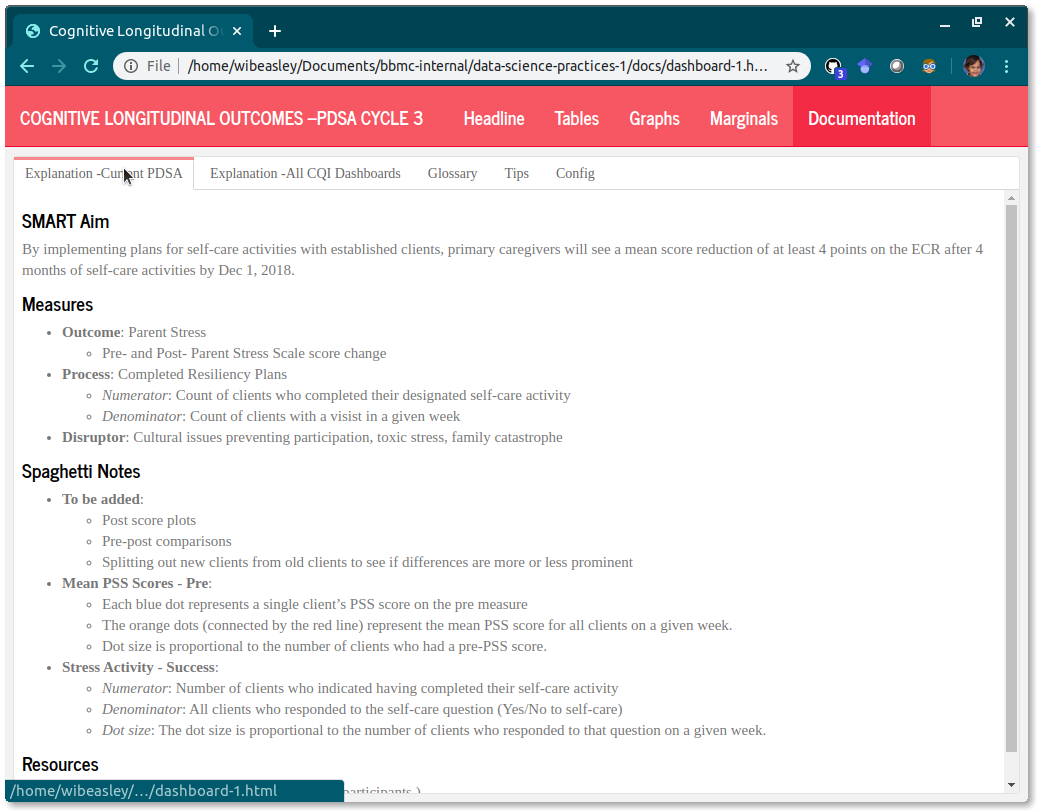
{.tabset}.- Explanation –Current PDSA
- Explanation –All CQI Dashboards
- Glossary
- Tips
- Config
F.2.6 Miscellaneous Notes
The hierarchy level in this outline indicates the HTML-heading level. Numbers are H1 (i.e.,
======) that specify pages, roman numerals are H2 (i.e.,------) that specify columns, and letters are H3 (i.e.,###) that specify tabs.-
Cosmetics connote the type of dashboard. Specify using the
themeorcssyaml keywords in the Rmd header.Common measures:
theme: simplexuses a red banner.1st cycle PDSAs (i.e., initial cycle of MIECHV 3):
theme: cosmouses a blue banner. This default is used if no theme is specified.2nd cycle PDSAs:
theme: flatlyuses a turquoise banner.3rd cycle PDSAs:
theme: journaluses a light red banner.-
4th cycle PDSAs (i.e., initial cycle of MIECHV 5): custom css with a purple banner (a public copy of this css is available). Instead of a theme, the below line (with four leading spaces, because the yaml entry is nested under
outputandflexdashboard::flex_dashboard)css: ../../common/style-cqi-cycle-4.css
F.3 Architecture
The dashboard is only one piece of a large workflow. The design and construction of this workflow are discussed in this book, which are highlighted below.
 .
.
F.3.3 Analysis-Ready Dataset
Very little data manipulation should occur in the dashboard. The upstream scribe should produce an analysis-ready rds file. The dashboard should be concerned only with presenting the graphs, tables, summary text, and documentation.
Include a common measure if the PDSA explicitly mentions it. Try to show measures only if they’re directly related to the PDSA. The PDSA dashboard will have less exposure to change (which makes it easier to maintain). If a program needs context for their measures, they can look at the common measure dashboard.